8 Squarespace Font Pairings That Make You Look Like A Pro
Scrolling through the vast array of available fonts on the Squarespace platform is no easy task. In fact, when you’re trying to get your website up and running, the perfect font pairing is likely the last thing on your mind. Thankfully, we at The Denizen Co. think about fonts for a living. Today, we will be introducing 8 of our favorite Squarespace font pairings that will make your website look refined and professional.
Want to see our full font catalog? Click here.
1. FreightBig Pro + Europa
This soft and rounded serif vs. sans-serif font pairing is perfect for those who want to evoke a polished yet inviting brand presence. While the title font is big and expressive, the body font is understated and legible. This balanced pairing reads the best when the title font is much larger than the body font.
Keywords –
Wide
Rounded
Soft
Inviting
Honest
Trustworthy
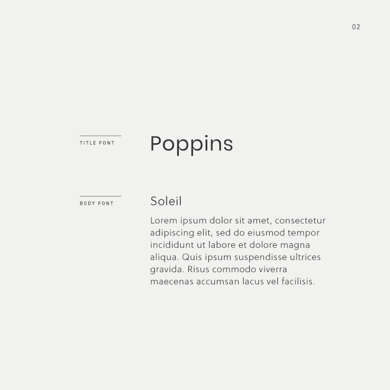
2. Poppins + Soleil
This modern and approachable sans-serif font pairing is perfect for those who want to convey a playful and personable brand presence. Where the title font lacks in scalability, the body font makes up for in legibility while both read like fonts from the same family.
Keywords –
Personable
Modern
Friendly
Playful
Clean
Hearty
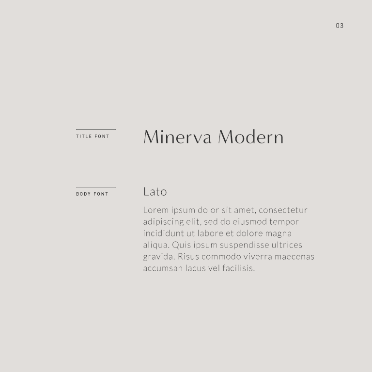
3. Minerva Modern + Lato
This polished and chic font pairing is perfect for those who want to evoke a sleek and feminine brand presence. While the title font exudes character, the body font is fine and understated. This high-contrast pairing reads the best when the title font is much larger than the body font.
Keywords –
Modern
Chic
Feminine
Fashion-forward
Sleek
Polished
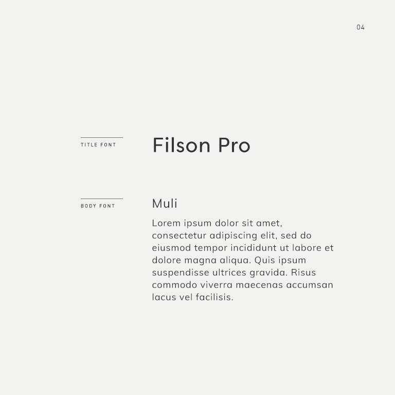
4. Forum
This round and friendly sans-serif font pairing is perfect for those who want to convey a tidy yet approachable brand presence. Both fonts read like they are from the same family while the title font ensures that your headings are scalable in larger sizes. This inviting font pairing reads the best when the title font is much larger than the body font.
Keywords –
Friendly
Trustworthy
Clean
Tidy
Inviting
Honest
5. DIN 2014 + Adobe Garamond Pro
This unlikely serif vs. sans-serif font pairing is perfect for those who want to evoke a refined and timeless brand presence. While the title font is linear and modern, the body font is classic and traditionalist. This high-contrast font pairing features the best of both modern and legacy typefaces.
Keywords –
Modern
Traditional
Classic
Timeless
Elegant
Refined
6. Acumin Pro + Helvetica Neue
This clean and structured sans-serif font pairing is perfect for those who want to convey a modern and established brand presence. The title font is best displayed with a thicker stroke and much larger size than the body font with slightly increased letter spacing for an airy feel.
Keywords –
Clean
Structured
Authoritative
Established
Scholarly
Modern
7. Aviano Serif + Futura
This high-contrast serif vs. sans-serif font pairing is perfect for those who prefer an expressive title font that exudes class and character. This unique font pairing reads the best when the body font is much smaller than the title font, and the title font can be either normal or all caps.
Keywords –
Wide
Decadent
Cosmopolitan
Classic
Unique
Authoritative
8. Goldenbook + Ainslie
This soft and ethereal serif vs. sans-serif font pairing is perfect for those who want to evoke a refined and feminine brand presence. Both delicate fonts read like they are from the same family while the title font adds much-needed character.
Keywords –
Soft
Ethereal
Delicate
Feminine
Refined
Timeless
Want to see the full font catalog?
Download our PDF booklet which includes 100+ designer-approved header and body font pairings carefully curated by our team here at The Denizen Co. Each font can be downloaded via Google Fonts or Typekit so you can implement the fonts right away and get a head-start on branding your business.


